BLOB #15 – “LOVE ABOVE ALL”

“LOVE ABOVE ALL” Newly installed Barone sculpture by Karen & Tony Barone


“LOVE ABOVE ALL” sculpture installed in front of sculptural parapet
at Paseo Court, Palm Desert, CA.


“LOVE ABOVE ALL”

Last year, while attending the WOMEN IN FILM “Broken Glass Awards” luncheon, Mitch Blumberg, our friend and “consigliere”, introduced Karen and I to an amazing and fascinating woman he knew through various Harvard connections. Her name is Dr. Mary Hsu, a graduate from the Harvard masters program. These days, in lieu of practicing medicine, she prefers to build things – like buildings. She has assembled a team of top-notch tradespeople and professionals to realize residential development projects which start from the ground up with the acquisition of vacant land.

Dr. Hsu decided she wanted a large scale work of art to landmark her current Coachella Valley project featuring six luxury residential rental townhouse units in Palm Desert, CA. She named the development “Paseo Court”.  She also wanted to acquire art to fortify the project’s luxury image and branding. Dr. Hsu wanted the work of art to stand at the front of the project and speak to the quality and inventiveness of her special development.

LOVE ABOVE ALL” Driveway/side view

We introduced Mary to a wide range of our sculpture. She was drawn to two unique figurative works which we had staged together to create a powerful synergy and narrative. She loved its positive message – LOVE! We installed the double figurative ensemble work in a similar manner to the way Dr. Hsu encountered them when she first saw the ensemble artwork. We directed the construction of two independent concrete plinths of different heights, one for each sculpture. Both plinths (concrete bases) are elegant and sculptural on their own with one being 6 inches higher than the other bringing the overall height of the ensemble to 9ft+ above ground level. Because the taller figure is holding a large heart way above its head, we titled the work “LOVE ABOVE ALL”.

Collaborating with Mary has been an exciting adventure! She approaches every detail from every direction, mostly intuitively from the inside out. She draws from her Asian soul and vast diverse education. With the acquisition of “LOVE ABOVE ALL”, Mary has acquired an ensemble artwork which “marks-the-spot”, i.e., a landmark art project to enrich the residential experience. Interestingly, in doing so, she has privately funded a highly visual public art project enriching the community and all who encounter the work day and night.

Thank You,

For more info regarding the works, please contact the BARONE STUDIO

kt@baroneart.com or 760.333.8953

BLOB #14 – “HEART BEETS”

“HEART BEETS”

When Karen, the girl of my dreams, and I eat dinner in a restaurant, we keep to our vegan diet. Sometimes, when out, I’ll order something with a small amount of cheese, e.g., Parmesan on pasta at Il Corso, Feta on a salad at the RITZ, or I give free reign to Tony DiLembo to choose any cheese he might add to his creations at The Tropicale. This occasional digression on my part can prompt Karen to whisper “you’re on a slippery slope”.

Karen is never on a slippery slope. She remains steadfast in eating “raw” and being vegan. She usually orders a mixed green salad with sliced beets, which is on the menu of each of the restaurants we frequent. She’ll requests her salad be prepared “without dressing”, not even “dressing on the side”. She eats about half of her salad and then requests the server to place the balance into a to-go box for her to take home.

On one particular evening while dining at ACQUA California Bistro in Rancho Mirage, a favorite of ours (I must add a disclaimer here; it’s not because we have a sprawling 54ft wide sculpture across its front), Karen performed her beet salad ritual.

After arriving home, I headed for the bedroom to empty my pockets and start to undress. We eat all our dinners at home in bed and that is where Karen would be heading in a short while to finish the rest of her salad.

An “OH NO!” shrill from the kitchen put me into superhero response. I darted to the kitchen “to save the day”. Karen had opened the to-go box to discover the beet salad was covered in a vinaigrette dressing. I exclaimed “don’t worry, I’ll fix it” and reached for the roll of 3M blue paper shop towels standing sentry on the kitchen counter. In my state of undress, I proceeded to undress the salad.  I blotted and pressed the oil away from the beets. Our hero! I had saved the beets; and the salad; and the day.

Karen and I deduced that when her salad arrived back at the restaurant’s kitchen to be boxed-up, an observant staff member noticed the salad had not been dressed. Team Acqua immediately moved to correct the problem and tossed the salad with an olive oil vinaigrette before placing it into the take-home box.

I was about to discard the blue paper towel, which now had been heavily stained in brilliant beet colors of deep dark red and golden yellow, when I realized I had just completed a home grown exercise in abstract expressionism. Not so much in the way of the drippings of Jackson Pollack, but more in the guided staining and color field technique of Morris Louis (the only abstract expressionist I’ve ever respected). Now in conservationist mode, saving the “beet art” from the trash, I moved what was now a small work of art to a safe place to dry.  It metaphorically occurred to me this was akin to what art critic Clement Greenberg had done to create credibility for Pollack, and other abstract expressionist and color field practitioners. He kept their canvases from being deposited into New York Trash receptacles.

I decided, along with Karen’s counsel, to frame the accidental artwork and gift it to Barbara and Jerry Keller, owners of Acqua California Bistro. I knew they would appreciate the humor and situational irony of how this artwork came about.

I  transported the fragile non-archival work to Mr. Art Hall. I say “Mr.” because his name, Art Hall, along with his profession as an art framer can get confusing. He is an extraordinary framer and in addition to framing Karen and my work, Art Hall is Barbara and Jerry’s framer as well. This made things easy for me. I simply instructed Art Hall to frame the beet art in the manner the Keller’s would like. It turned out great. It was beautiful and elegant, just like Barbara, but funny, just like Jerry.

15”X 12”(framed)©️ Barone MMXIX
WE lost Barbara in April. I say “WE” because she belonged to all of us. It’s my fault Karen and I didn’t get to give the “HEART BEETS” artwork to Barbara and Jerry. The fun and the gesture are unfulfilled. It’s Iike “if a tree falls in the forest…”.  Karen and I don’t know if we’ll ever be able to give the framed artwork to Jerry alone. None of us know how much time we have to complete things.
An Anecdote About Art Hall
We un-euphemistically call Art Hall “the framer to the stars”. The title is literal. He’s been in The Coachella Valley a long-time and he can tell-you-stories, and usually will.  I always allow for an extra half-hour when I’m dropping artwork off to be framed at 1st Gallery, his shop at The Atrium in Rancho Mirage. When I bring art to Art (see what I mean!) I always ask him “how much it will be?”  I ask, not because I am concerned with the price, but because along with a whole list of injustices that annoy him is credit card fees. Knowing the price in advance allows me to bring a check from the studio.
Thank You,

For more info regarding the works, please contact the BARONE STUDIO

kt@baroneart.com or 760.333.8953

BLOB #13 – “BOSTON COFFEE PARTY”

PREFACE 

In 1773 the BOSTON TEA PARTY not only was a revolt by the colonialist against taxation by England and King George III, but It was also a revolt against tea itself and generated a mass switch from tea to coffee.

“THE BOSTON COFFEE PARTY” 

The 1st painting to be completed by us, Karen and I, in 2019 is titled “THE BOSTON COFFEE PARTY”.  Because of our preoccupation in creating large scale outdoor sculptures and big art-in-public-places installations, these days a painting takes a very long time to complete. This is in spite of continually transversing the “RABBIT HOLE” – the part of our studio where we paint. This painting was initiated a year ago in early April 2018. It is the 1st painting in decades which I have executed without having Karen painting along side of me – No! No! No! She hasn’t left me – Thank God!

Since starting to create her “AmuseBouche,” “PLAYTIME” and “RADIOACTIVITY” staged-performance-video-art self-portraits three years ago, she has become more and more immersed in her unique creative process. She creates the sets, costumes, stills, video photography, lighting, special effects, editing, sound effects, and musical scoring; all done to a level of manic obsession. She has even tricked-out a special 360 degree all black photo/video room with black floor and wrap-around floor to ceiling blackout hospital track curtains + mirrors + 10ft.rolls of seamless. So now, along with the Studio: the Atelier: the Rabbit Hole: the Courtyard:  the 50 and 75 cents tour: the Yellow Brick Road – we now have the Black Hole.

Karen’s opinions on this painting have frequently been offered; even more frequently requested. Although she did deliver a brookah-or-two on occasion, she did not have a physical hand in the painting process. So, using a color palette, practices and techniques Karen and I had developed together over the years, I was pretty much on my own to apply paint to canvas or as the artist-turned-film-maker Julian Schnabel put it “push paint”.

The painting is 5ft W X 4ft H. It is a  diptych comprised of two irregular four-sided stretched canvases joined together to form a somewhat erratic pentagonal shape. Being sculptors, we find non-rectilinear forms more interesting and more expressive. The shape of the canvas can be an integral tool in the visual experience of viewing the painting. We use the shape of the painting to not only heighten the painting’s visual excitement but to move the viewer’s gaze around the painting and underscore the painting’s composition.

At the point when I start putting oil paints on the canvas, I utilize basic Euclidean geometrics to divide and conquer the flat surface. I lay down brightly colored planes and patterns in front and behind one another to create depth and directional movement which chauffeurs the viewer on their compositional journey.

In our sculpture, we use only nine weather and time tested colors. However, that is two more colors that are in a rainbow and three more than in the basic Star of David color wheel. The “oils” are generally straight from the tube and uncut. With only six basic colors in the world, selecting colors to apply to the canvas can be a frustrating exercise in the deduction. So, I rely on color posturing techniques to increase or reduce, but mostly increase, the volume of a color. I frequently place “complementary” colors up against each other and let them do their magic.

The idea for the subject of this painting came when I was looking at a U.S. postal stamp commemorating the Boston Tea Party. The USPS had used an early American artist’s etching which depicted a riotous scene of Indians attacking English ships in Boston Harbor. The etching clearly and dramatically showed dark silhouetted feather adorned masculine figures dumping the precious cargo of tea from ships into Massachusetts Bay. I then sought out 18th-century artwork along with more information on this historic event. I searched for visual records, which at the time was the responsibility of artists and engravers. I was intrigued by how the colonials dressed in Native American Indian disguises to avoid detection from the British.

With my mind on fast-forward, I thought about how today people who had skin-in-the-game and who were looking to secure “their fair share of the future”, were applying revisionist history and political correctness to early American occurrences – and how time changes everything. How Indians are now referred to as Native Americans.  How English tea lost it’s global dominance to America’s beverage of choice – coffee. How the once popular colonial American coffee house culture was changed forever. How the Boston Tea Party kindled political protest and demonstration into America’s DNA. How Turkish-coffee-became-Italian-coffee-became-American-coffee. How faux Italian American coffee shops have invaded almost every country on earth. How the wealth derived from coffee has even fueled the political ambitions of some coffee company executives.

I changed my original working title for the painting from “The Boston Tea Party” to “The Boston Coffee Party” just to be cute. It wasn’t until I was well immersed in the painting and about halfway to completion that I switched titles. However, it wasn’t until the painting was completed did I become aware of how America transitioned from tea to coffee and realize how coffee has always been an integral part of our history. For me, so much of life’s interaction is bashert!

ADDENDUM

I was cleaning out a file folder I kept on my recently completed oil painting titled “The Boston Coffee Party”. The painting was finished and I had even written an essay about the painting and the process. (The BLOB #13 above) While purging the folder of the unnecessary, and retaining only the notes, thumbnails and working drawings which were relevant, I came across a spent envelope Patty Newman had used to send Karen and I a “thank you” card for supporting Digicom, a non-profit which she strongly supports. One of the stamps on the envelope was a Boston Tea Party commemorative. Well! This postage stamp inspired me to stretch and join two anti-rectilinear canvases and take the first steps on a yearlong journey which would result in realizing this artwork. 

Thank You,

For more info regarding the works, please contact the BARONE STUDIO

kt@baroneart.com or 760.333.8953

BLOB #12 – “ENCOUNTERS with HARVEY”

Karen and I were challenging life living in SoHo, an evolving single square mile artists’ district in lower Manhattan. We had moved from Chicago’s Gold Coast to an expansive 4th-floor industrial loft in a 6 story 18th century “cast-iron historic landmark” building on the corner of Prince & Wooster, one block below Houston (colloquially pronounced: House-ton). SoHo is an acronym for “SOuth of HOuston”. Houston Street marks SoHo’s northern frontier, the other side of which is Washington Square and “The Village”. Veer right and one was in the campus cluster of buildings pulsating with students at NYU. Little Italy was to the south and within walking distance (in New York we walked – a concept lost after moving to LA). Just below Little Italy was Chinatown (still within walking distance). Head south, picking up art supplies at Pearl Paint on Canal St. along the way, and you would be standing in the next loft and hipster restaurant frontier – TriBeCa (Triangle Below Canal).

Within SoHo’s perimeter were vestiges of an old Italian neighborhood anchored by St. Michael’s Catholic Church and School, specialty cheese shops, bread shops, small grocery stores and meat markets. Also at the N/E corner of SoHo, where one crossed into The Village, was a neighborhood within a neighborhood; a small enclave of Portuguese-Americans with businesses and markets to sustain them. No matter how far immigrants had strayed from their country of origin, they brought their food, dress, and customs with them. The Portuguese were no different – which – kept them different.

Every one of the fragmented demographically unique neighborhoods was a stone throw from where we now lived and traded and where the aromas changed as we crossed streets and traversed cultures.

SoHo’s topography consisted of primarily 5 and 6 story industrial loft buildings containing a different manufacturer on each floor; many still pulsating with light industry. They had yet to be converted to the creative domiciles of the new breed of artists converging on New York City from every corner of the globe.

We gutted and renovated our open plan loft space into an all-white inside-out environmental sculpture with giant trapezoid shaped floating rear projection screens which divided the studio workspace in the back half from the salon hung gallery from front half. We installed a half-dozen 6ft. & 8ft. long irregular shaped mirror clad pyramids which we hung upside down from the 12-foot high ceiling – creating a slightly disorienting illusion that altered the rigid rectilinear footprint of the 2000 sq. ft. space.


The FIRST ENCOUNTER  w/HARVEY

Karen and I would walk the colorful few short blocks from our SoHo loft through The Village to its western frontier to forage from the bountiful shelves and brightly lit refrigerated glass deli cases of Balducci’s – an Italophile foodie’s dream come true.  Balducci’s food stalls were jam-packed with Italian food specialties. Waxed cheese, dried salami, along with every variety of Italian salumi, cured and smoked meats, hung strung in bondage from meat hooks at just above eye level. It’s offering of fresh produce and hard-to-find (in America) Italian vegetables were in “abudanza”!

(Keitel portrait)

“Harvey,” in these encounters, is actor Harvey Keitel … a young neighborhood tough familiar to those who occupied the “members only” Italian social clubs which operated out of small store fronts and dotted New York’s Village and Italian-American neighborhoods below Houston Street, which included Little Italy.  Keitel, at the time, had already become known to New York’s art underground, and was soon to gain big film recognition starring in “The Dualist”, the French period piece, directed by Ridley Scott and set in Napoleonic France.


In the film, Keitel shared top credits with Keith Carradine and at first blush appeared awkward dressed in the oversized French lieutenant uniform of heavily layered richly colored fabric abundantly garnished with golden military braids and tassels. He was the personification of early 19th century French hand-colored etchings created by Joseph Napoleon’s (Bonaparte’s elder brother) “Spanish Regiment”.


The film had not yet been released in The States when Karen and I ran into Harvey at Balducci’s. He was in a tight covey of downtown hipsters when we walked up to him and I said “We just got back from Paris where we saw you in “The Dualist” in a Champs Elyse (English version) cinema and it was great”. He replied, while twisting in the direction of his small audience, “Shit! I’m in the fuckin’ film and these guys go and see it in Paris … I don’t even get to see it”.


Now, after that 1st encounter, we knew each other and would run into one another on the streets in Soho. On several occasions we saw Harvey in one of the sparsely frequented coffee houses that opened early for breakfast. SoHo was a nighttime neighborhood and very quiet in the morning except for trucks in service to some of the light industry still hanging on.  Chauffeured limousines and gallery hopping cognoscenti arrived after noon for a chi chi lunch at Soho Charcuterie. Late afternoon taxis swarmed in to deliver the uptown afterwork cocktail crowds to arty watering holes. This uptown migration was closely followed with still more taxis to fill the trendy restaurants for the evening. Each day culminated with SoHo’s abundance of bars being packed to the gills with artists at night. They had moved down from Warhol’s Union Square back room courtship at Max’s Kansas City and the Subterranean dark room digs of the Village.


Some of those bars became synonymous with certain subsets of artists. Red Grooms created colorful painted impasto reliefs of life in the Broom Street Bar. Like “Broom Street”, many of the “joints”, which were all in close proximity, were named after the streets they were to be found on. “Spring Street Bar” was at the corner at West Broadway, SoHo’s epicenter. “Prince Street Bar” was at the corner of Wooster and next door to the entrance to our loft building. Lofts, bars, restaurants, shops and galleries were shoulder to shoulder and stacked one above the other. However, because only one or two residents, usually artists, occupied each loft of several thousand square feet, SoHo had the lowest population density in Manhattan and everyone knew one another. Based on a creative and artistic commonality SoHo had achieved an almost small town cordiality.


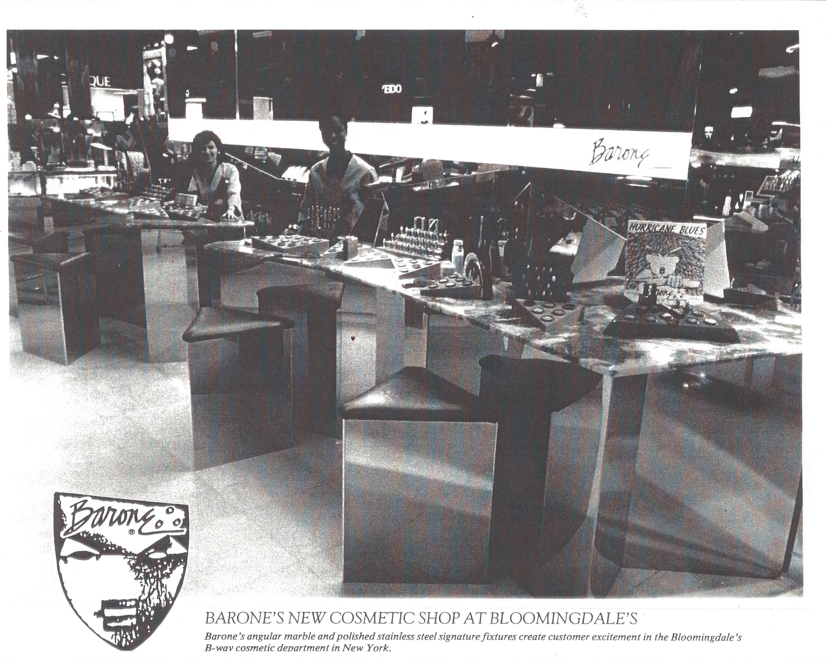
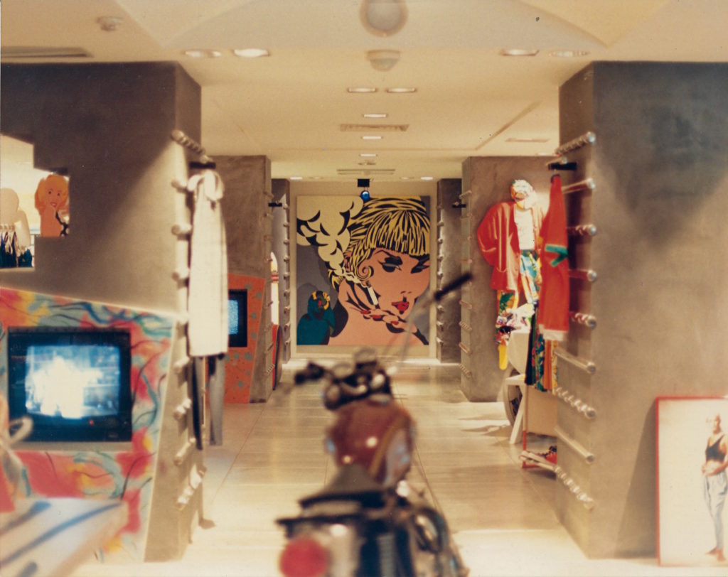
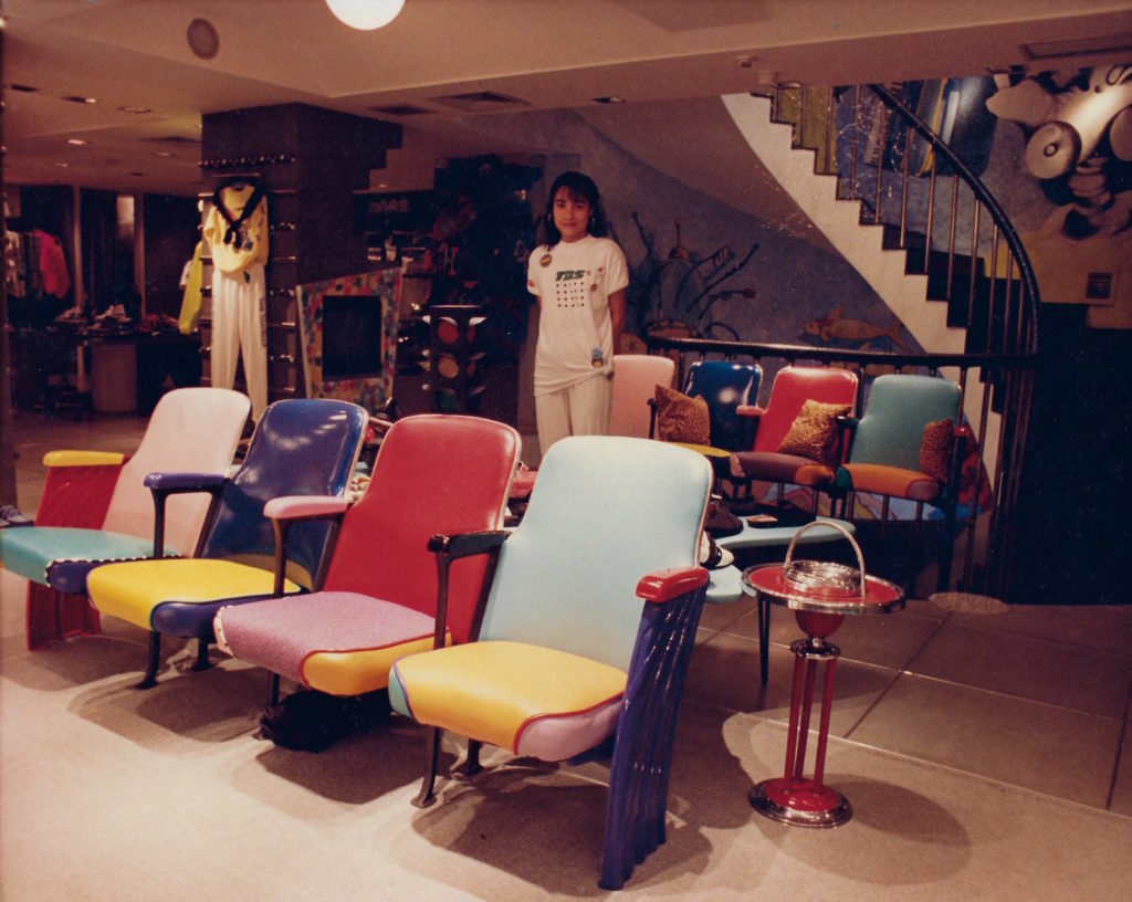
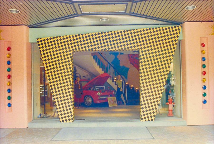
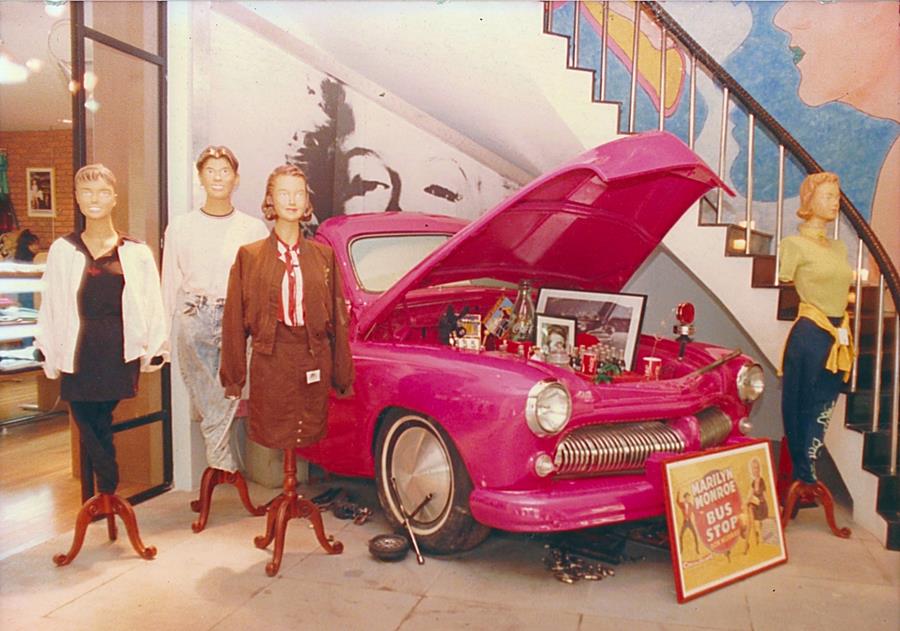
“The kids”, those who staffed BARONE – the store – differed from the “studio assistants”, who staffed the BARONE loft. They didn’t show up for work until noon.  Noon is when the shops opened in this small cohesive artist neighborhood where many worked creating art late into the night and slept through the morning. This late start gave Karen and I an opportunity to show up at the BARONE store in the morning before it was open and before the kids showed up.


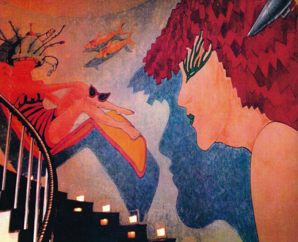
Retail is a creative pursuit. Simultaneously reflecting and influencing the culture it inhabits. Combine retail with art and the result is a creative stew that is always on the front burner. No one understood this better than Andy Warhol who danced in a world of “Art, Business, the Art of Business and the Business of Art”.  Like Warhol, Karen and I operated on a 10 burner range, moving pots back and forth, turning up or lowering the heat here and there. Back then, as it is today, commissioned artworks always moved to the front burners – “where work filled the time”.


On frequent “dates” Karen and I, dining alone Uptown together at Les Madri (Peter Lugar’s  Italian restaurant staffed by a kitchen of Italian mothers) … or at Raga (the world’s most elegant East Indian restaurant)  … or at Café des Artistes (on the ground floor of the building where Salvador Dali and Gala lived) … or at la Cirque (the epitome of haute French gastronomy) … and at The Four Seasons (where dinner started with the heightening of the senses by consuming James Rosenquist’s 7ft X 24ft painting “Flowers, Fish and Females,”  passing through Phillip Johnson’s classic modern portals), the conversation would turn into a wine-relaxed creative conceptual retail jam session where an inspired Karen would say “let’s get out early tomorrow (morning) and rearrange the store”.


Occasionally Karen and I would start our day at one of SoHo’s bare bones espresso and scones coffee houses: The Cupping Room on West Broadway or The Elephant & Castle on Prince St. Sometimes, we would hike up to The Village and pop into Rocco, the Italian pasticceria, or drop into a well worn “Café Espresso” where the post-beatnik era beatniks hung out and the ghosts of Burroughs, Ginsberg, Kerouac still lingered. On a few of these occasions we would bump into Harvey. We were starting our day –  he was ending his. He usually was in the company of what-we-now-call a “super model”. You knew she was a super model by the fact she was over 6 feet tall, had very long legs clad in skinny jeans which ended with spike heels tucked in below the cuffs – and she was beautiful. Her fashion m.o. was topped off by a made-to-look-used brown leather bomber jacket unzipped to reveal a white T. In sharp contrast, Harvey, looking a bit scruffy, always wore a long oversized dark grey and woolly Salvation Army Store sourced overcoat.


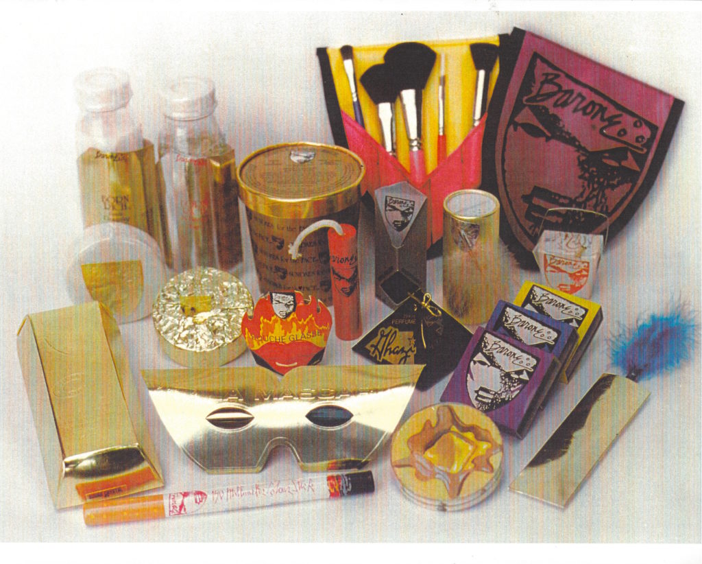
On one particular early Sunday morning, we made ur way down the quiet block-and-a-half walk from our loft to the BARONE store and started rearranging fixtures, displays and product in accordance with strategies plotted out over dinner the night before. It was probably about 9:00 AM, with the streets still empty, when Harvey, joined by a tall beautiful model, passed in front of our shop. Because of the forced perspective design of the storefront, we could hear the conversations of those on the side walk – even with the doors closed. As the two passed, the model paused and looked into the storefront windows and said to Harvey “oh, I love this store!” He responded, “you love this store?”. “Yes” she replied “they have the greatest makeup”. Harvey then said “do you want to go in and play with the makeup?” She answered “they’re closed”. Then Harvey, peering through the glass in one of the pair of French doors with his hand above his eyes to reduce the glare, said “I know these people, they’re friends of mine and they’re in there – I can see them. They’ll let us in.” With that he began rapping on the door’s wood frame. I walked toward the entrance while reaching into my pocket removing the keys along with a couple of loose singles. I unlocked the door, opened it about half way and pressed the dollar bills into the palm of his hand and said “God bless you.” Then I closed and locked the door – turned to return to Karen at the back of the store. Keitel, in his “vintage” overcoat with the model just over his shoulder, stood stunned, speechless, and motionless in disbelief.

After a long pause, I returned to unlock the door again, this time to allow Harvey, with the model in tow, to enter and “play with the makeup.”


FINI

Thank You,

POST NOTE:  

NEW! Karen & Tony’s latest painting & sculpture…

“LOVE BUNNIES” ©2017, automotive paints over solid aluminum
90”H x 94”W x 33”W

“LOVE-BUNNIES”  by Karen & Tony Barone, was just recently completed and has already started listing a prestigious & meaningful provenance. “Love-Bunnies” will be featured on the Red Carpet at the PS Convention Center during the 2018 STEVE CHASE AWARDS in support of DESERT AIDS PROJECT.

Event: Saturday, Feb. 10th, 2018.

“LOVE BUNNIES” (the painting) ©2017, O/C,
“Love Bunnies” ©MMXVII  – 51”h x 42”w

Painted on non-rectilinear irregular hexagonal stretched canvas was created by Karen & Tony in their usual manner – together. It is one of a series of paintings which contains a strong narrative of love and hope.

For more info regarding the above works, please contact the BARONE STUDIO

kt@baroneart.com or 760.333.8953

BLOB #11 – “WET BEHIND THE EARS”

The question I am most frequently asked is “how long have you and Karen been married?” or “… together?”, if the inquisitor is not sure we are married. Since I never offer a true account, I sometimes reply “not long enough!”, deflecting the question to avoid placing a barometer on our passion, e.g., 30 years – comfortable; 5 years – HOT!

In the last century, B.P.S. (Before Palm Springs), when we were living on The Canals in Venice, CA, we received a phone call from Robin Abcarian, the reporter, now editor, at the Los Angeles Times. She wanted to come to our canal side studio and interview the two of us.  We welcomed her but with some stipulations. We told her “there are 3 questions we would not answer: 1. How old are we? 2. How long have we been married? And 3. Do we own or rent?”  Later in an article which was featured in the L.A. Times Sunday Magazine with a photo of Karen and I spread across the front page, Robin went on to explain the “how long … married?” barometer theory after starting her article by advising her readers “if you meet the Barones don’t ask them …”

The 2nd most frequent question seems to be “how long did it take you to make that sculpture?” or “… that painting?” I never really think about “how long does it take” unless we have been commissioned to create a specific artwork or the artwork is slated for an exhibition or installation at a public places site. Also, artwork slated for installation at an institutional site, such as a museum or hospital, or commercial site, such as a mall or restaurant, will prompt our awareness of the calendar. Under these circumstances, the project is moved to the front burner and a work-fills-the-time critical path is established.

“Reigning Prince”/“Purple Reign” ©MMXVII
O/C:  35”H x 41”W  pentagonal shaped canvas

I became acutely aware of “how long did it take?” when Karen and I recently completed this last series of paintings. It was easy to establish “how long” because I had the dated receipts for the stretched canvases and the paintings were all completed within days of each other. This is because of a “wet over dry” technique we have developed over the years. In the application of our unique “wet over dry” technique, we apply one layer/color of oil paint pigment at a time. Within this technique, we must wait for each layer to dry completely before “going back in” with the next layer of color. We can’t stop working; so, we move on to another one of the other four “works in progress” canvases while allowing the freshly worked-on canvas to dry.

“Synchronized Swimmers” ©MMXVII
O/C: – 36”H x 60”W (slight trapezoid)

This recent series of five paintings, which encapsulate a stronger and deeper color palette set off by darker modeling and shadows, and various other new elements, needed to be introduced into the lexicon of our oeuvre. The following is the correspondence to certain galleries, art dealers and collectors, fashioned to make the introduction:

We’ve just completed 5 canvases in a new series of paintings started at the beginning of this year. They reflect our continued obsession with our “POLKA-POOKA” rabbits. However; in these paintings, our flat floating red herring “ready-mades” have disappeared and our familiar “POLKA-POOKA” rabbit protagonist finds itself at center stage in a strong dreamlike narrative. We continue to avoid the rectilinear canvas in lieu of an irregular trapezoid, pentagon, and hexagon. Our canvases take on a sculptural element which brings them beyond the function of an irrelevant sub-straight. They are part of the paintings; not just what the paintings are on. After all, we are sculptors and the shape of each canvas is somewhere between the 2D and 3D.


“Love-Bunnies” ©MMXVII
O/C: 51”H x 42”W  hexagonal shaped canvas

We enjoy saying “these paintings are wet behind the ears”. but they are ready for prime time. Although individually powerful, we would like to see them exhibited together in a public venue. They have a strong cumulative synergy when presented collectively. The paintings are each priced at $10,000.

“Aurora Borealis” ©MMXVII
O/C: -36″H x 46″W (trapezoid)
“Oh Beautiful …” ©MMXVII
O/C: – 56″H x 48″W (trapezoid)

ALSO, just prior to the time consumed by the above-mentioned “Dream Narrative” series, a “front-burner” commission came in. Our “POLKA-POOKA” rabbits caught the attention of the Chuck Jones family. Chuck was the famous Looney Tunes animator of Bugs Bunny  (+ Daffy Duck, Wile E. Coyote & “beep-beep”, the Road Runner). We thus created the large photorealistic painting titled: “BUGS IN A HARE RAISING EXPERIENCE”. We placed Bugs in a windstorm of 10 flying “ready-mades” referencing various Bugs Bunny cartoons. A three finger and a thumb white glove, a Viking opera helmet, were two such elements which we appropriated into the painting. The painting commission was for the creation of a seminal work which would foster a series of half-size limited edition prints to be unveiled at an exhibit opening on St. Patrick’s Day 2017 at the Chuck Jones Gallery in San Diego, CA. This ambitious undertaking  required signing a licensing agreement with Warner Brothers – signed – sealed – delivered. This specially created one-of-kind trapezoidal oil on canvas painting is now available for purchase. It’s price is $15,000 and obtainable exclusively from the Barone studio. The limited edition (40) prints are available through BARONE and The Chuck Jones Gallery @ $850. A special limited edition (10) prints on stainless steal are also available.

“Bugs In A Hare Raising Experience” ©MMXVII
O/C: – 48”H x 60”W (trapezoid)
Thank You,

For information regarding the works above, please contact kt@baroneart.com or 760.333.8953

BLOB #10 – “RAMBLING THROUGH TIME WITH ‘MODERN©MAN’”

The seminal use of our silhouetted “MODERN©MAN” figure, which is frequently found in our sculpture, painting & drawings, goes back to my 2nd year as a student at The School of the Art Institute of Chicago. I needed to create a “scale figure” to use alongside my sculpture maquettes and with interior and exterior architectural elevation drawings. I was inspired by Corbusier’s solution for the same requirements. However, I wanted my scale figure to appear androgynous and be completely drawn only by using a single continuous line without lifting the pencil off the paper – Voila! “MODERN©MAN”!

Drawing of Modern©Man & Corbusier’s scale figure, side by side ©Karen & Tony Barone

After the calendar changed centuries and 911 changed everything, we traded the sand at Muscle Beach for the sands of the Palm Springs Desert. Morning coastal gloom was exchanged for over 348 days of sunshine a year. We switched from our massive and monumental Canal-side minimalist 3 story studio-residence on the Pacific Coast in the Los Angeles community of Venice (Beach) for a low slung Mid-Century Modern ranch style house with 360 degrees of desert landscaping in the Palm Springs California Desert community of Rancho Mirage.

California Homes (Magazine) cover of Barone studio/residence on the Venice canals

We traded the LA County Museum of Art (LACMA) for the Palm Springs Art Museum (PSAM). Our local architectural influences changed from Frank Gehry and Googie to the likes of Krisel, Cody and Kaptur – – – “We got out of Dodge” – and set up shop in what is now “our desert paradise” – “Paradiso Secco”.

“LAST ONE OUT OF LA … TURN OFF THE LIGHTS”,  a 10 foot wide forced perspective triptych ©Karen & Tony Barone

Our painting, “LAST ONE OUT OF LA … TURN OFF THE LIGHTS”,  a 10 foot wide forced perspective triptych, reflects on some of what we and others were feeling in the new millennium. The portrait of Karen, which dominates the large rectangle shaped center canvas, was based on a color-pencil drawing I sketched of Karen while on one of many trips to the neon-sign-cluttered colonial port city of Hong Kong. I reimagined Karen as a neon sign. The triptych, which was executed by the two of us, followed the original drawing by almost two decades. We abandoned the ordinary rectilinear construction of the canvas stretcher bars on the outside canvases for mirror-image trapezoids. This resulted in a single point forced perspective. The forced perspective make the left and right canvases appear to project off the wall in a somewhat Cinemascope effect. They make the painting more sculptural and categorically place the artwork somewhere between painting and sculpture. They make the canvas an integral part of the painting, not just a substrate for the oil paints.

Moving to “The Desert” did not force us out of being in the proximity of water; however, this time the water was in a large amoeba shaped swimming pool with a waterfall enhanced spa. Actually, the water in the Venice Canals was closer to our patio in LA than the water in our pool is to our patio in the desert.

Barone Pool ©Karen & Tony Barone

Architects like Eero Saarinen (1910-1961) and their architecture (Think: Gateway Arch, St. Louis; TWA Terminal @ JFK) have always influenced us and our work. In Chicago, we were solidly grounded on the rich history of the “Prairie School”: Louis Sullivan and Frank Lloyd Wright. We worked in the long shadows of the towering sky-rise architecture of Mies Van der Rohe and Skidmore. The Art Institute introduced me to Le Corbusier and also Walter Gropius and the Bauhaus. However, Frank Lloyd Wright theory dominated the classroom, perhaps because my principal instructor was a protege’ of “Mr. Wright”. Chicago, the city itself, was a museum in real time. Sullivan, Wright and Mies were everywhere, not just on pages in books and screens in the lecture hall.

Portraits of Sullivan & Wright

As art gypsies, Karen and I had taken a sequitous journey to the Desert. Starting in Chicago, where we met, fell in love and married; to SOHO in New York where we collected more art chevrons. A horse farm in the foothills of the Smoky Mountains in East Tennessee followed – then Venice Beach – and finally Palm Springs. As artists, we have always been convinced we could live anywhere. Our work went with us – our art  went with us. Art was in our heads and at our fingertips.

SOHO Loft ©Karen & Tony Barone
Tennessee House ©Karen & Tony Barone
Chicago Loft ©Karen & Tony Barone

Back then, just a little over a decade ago, no one had heard of the “Coachella Valley”, let-alone know where it was geographically. And, although we were going to be living in Rancho Mirage, a community in the middle of the Coachella Valley, we would describe our new home and studio as being in “Palm Springs” or “in the Palm Springs Valley” – it saved explanation.

“MODERN©MAN” survived the cross-country relocation and was reinvented as a protagonist in our paintings and sculpture. At the Art Institute of Chicago, “MODERN©MAN” would help me communicate the scale/size of my art. In the desert it became the art. Now it helps Karen and me to communicate to others what is in our hearts.

Day-time photo of “Joined At The Heart” at Desert Arc ©Karen & Tony Barone

Recently “MODERN©MAN” reached its pinnacle in stature and purpose when we clustered 5 brightly colored shimmering aluminum life-size “MODERN©MAN” concave and convex silhouetted figures into a 9 foot wide ensemble sculpture on an enormous concrete truncated elliptical pad. We titled it “Joined At The Heart”. We created, built and, moved by passion, donated this artwork to DESERT ARC, one of the Coachella Valley’s most purposeful organizations in the service of humanity.

Night-time photo of “Joined At The Heart” at Desert Arc ©Karen & Tony Barone

We were concerned far too many people were not aware where this special organization, which offers services to those adults in our community with special needs, is located. We wanted to draw attention to the Desert Arc campus. Its buildings are set back behind its street-side parking lot and mostly removed from the eye of the public. Signage wouldn’t do what art could do to draw eyes. We wanted to establish a high level of “street presence” for those passing on Country Club Drive. We wanted the community to pause – take notice – and think about “this place” and its 700 clients and the 250 staff plus volunteers who serve, care for, teach and train Desert Arc’s physically and mentally disabled adult clients.

We must thank Desert Arc’s Richard Balocco and Mitch Blumberg for allowing us to express our feelings and contribute to their mission. Our sculpture celebrates the love in Desert Arc’s mission to “Enhance the quality of life and create opportunities for people with disabilities”.

As we tap away at this latest BLOB, “MODERN©MAN” achieves new heights. We are cutting, bending, welding and painting two very tall “MODERN©MAN” figures. They reach to the sky while each holds a 6 foot long metal fork above its head. Each of these two figurative works is over 8 feet in height and represent the human element in a sprawling sculpture reaching approximately 30 feet in height and 50 feet in width.

The Desert’s dynamic and extraordinarily philanthropic couple, Barbara & Jerry Keller, whose generosity reaches all of us, have engaged and challenged Karen and me to create an iconic artwork for their NEW restaurant currently under construction at “The River” in Rancho Mirage. The new restaurant is called ACQUA CALIFORNIA BISTRO.

ACQUA is being designed by Jeff Jurasky and, true to his reputation in the wake of having created the Keller’s Lulu in Palm Springs, promises to be a spectacular place to meet and eat, a “Centro” to the Coachella Valley. It will be more than “a well lit place”, it will dazzle!

Thank you,

BLOB #9 – “CHANNELING CHUCK JONES”

I am a composite of skills and knowledge inherited from all those artists who have come before me.

In my most recent incarnation, I am channeling artist Chuck Jones, the world’s most collected cartoonist, animator, filmmaker and Pop art practitioner. The impressions he left on me when I was a “baby” artist, but an artist none-the-less, are indelible. Now that I am more skilled, I am even more aware of how skilled he is. I say “is” because although he passed in 2002 at nearly 90, I speak of him in the present because I continue to “draw” from him.

Portrait of Chuck Jones ©Karen & Tony Barone

Studying his artwork, especially his drawings, made me aware of how rhythmic, lyrical, free and flowing they are and how they contain such exceptional “line quality”. I can see his hand, Blackwing pencil in tow, gracefully sweeping across a blank paper placed on his drawing board. In an almost rhythmic arc his hand pivots from his wrist. I can see how his elbow had to have become the center point for a sweeping radius. The movement is akin to the performance of a virtuoso violinist.

I began by absorbing the essence of his drawing skills through the scrutiny of a copy of a loosely drawn pencil sketch with a red penciled yellow correction tissue overlay. It was sent to Karen and me by Chuck’s grandson, Craig Kausen, President of Chuck Jones Galleries. He sent the drawing shortly after a visit he made to our studio with three other Chuck Jones Gallery professionals including Michael Fiacco, the Director of the Chuck Jones Gallery in San Diego.

Drawing is the foundation, pillars and cornerstone of Chuck Jones’s artwork. Drawing is also the seminal element for all of Karen’s and my work. Our sculptures, paintings, and architectural design all find their origin in our pencil preliminaries and conceptual drawings. Chuck and I approach our artwork through our ability to draw. We already had whimsy and joy in common. In an eureka moment it all clicked for me. That moment was when I received the copy of that loose pencil sketch of Bugs by Chuck Jones. He and I became fast-dry-glued at the hip.

I am absorbing Chuck Jones just as a l have absorbed artists the likes of Ed Pascke, James Rosenquist, Roy Lichtenstein, Marcel Duchamp and Andy Warhol. All, with the exception of Duchamp, were easier to absorb because I knew them personally; they were of my time. Duchamp’s osmosis was not about technique or style; it was purely cranial and conceptual.

However, this time the absorption of another artist is more purposeful. Craig had requested Karen and I create a full size, 4ft X 5ft painting in the trapezoid style of the other 12 paintings to be exhibited in their San Diego California gallery. Only for this painting, could we replace our giant chartreuse “POLKA-POOKA”, which was derived from our sculptures, with a new protagonist – Bugs Bunny, the world’s most famous rabbit?

We accepted the challenging opportunity with excitement. Karen and I would face-off with Bugs every day, drawing and painting to our hearts content. For us, this added an additional endorphin release created by including the personification of Bugs to our trapezoid shaped stretched canvas in our painting studio – recently rebranded: “The Rabbit Hole”

Craig Kausen, Karen & Tony Barone in the Rabbit Hole with Barone-Bugs painting titled: “BUGS IN A HARE RAISING EXPERIENCE” ©Karen & Tony Barone

In our “Polka-Pooka” rabbit paintings, the principle subject(s), the chartreuse rabbit(s), is surrounded by flattened irrelevant and unrelated black outlined objects. The objects are selected because we like the way they look and because they are visually interesting or because they turn the volume up on happy; NOT because they drive the narrative. We call the objects we float around the “Polka-Pooka” rabbits “ready-mades”; a tip-of-the-hat to French-born American surrealist Marcel Duchamp. (1887-1968). The completed painting poses more questions than it answers. The false-cognates pastiche introduction of the ready-mades requires one to linger with the work and experience it longer; perhaps to the point of captivation.

In “BUGS IN A HARE RAISING EXPERIENCE,” the “irrelevant” objects surrounding the irreverent Bugs are anything but irrelevant. They are snippets of costumes and props from the archives of some of the 167 Bugs Bunny cartoons: Rabbit of Seville, What’s Opera, Doc? … The objects are illogically flying towards Bugs in a powerful singularly directional wind from the famous rabbit’s animated past. It’s deja vu all over again!

I have not mentioned the endless wit of Chuck Jones, nor the “Chuckles” created by the twists and turns of his visual puns. They are not only entertaining and funny – they are brilliant! My objective in this issue of The BLOB is to share whom I have become by channeling Chuck Jones through the scrutiny and study of his drawings. His technical mastery as an artist surfaces when one studies his drawings … that’s … What’s up, Doc!

“BUGS IN A HARE RAISING EXPERIENCE” 4ft X 5ft ©Karen & Tony Barone

POSTSCRIPT 

It is impossible not to be happy. I am living in kindergarten, painting and forming bunny rabbits with my best friend – ever!

We are obsessed with creating “POLKA-POOKA” rabbits in an area of our studio which we have tricked-out for Karen and I to paint together. Unlike our sculpture which draw their color from a carefully developed and tested palette of 10 transparent automotive enamels, the “POLKA-POOKA” rabbits emerging from the “The Rabbit Hole” have always been chartreuse. However, the sound fueling the mood for our creative tango is frequently “White Rabbit” – although lately, an endless loop of Neil Young picking and crooning “Harvest Moon” has  re-choreographed our creative tango into a romantic shuffle.


For information regarding the above mentioned exhibit & works by
Karen & Tony Barone
(on exhibit thru April 13th, 2017)
contact:
Chuck Jones Gallery in San Diego
Michael Fiacco, Gallery Director
mfiacco@LJE.com
619-294-9880
OR
The BARONE STUDIO
kt@BaroneArt.com
BaroneArt.com

BLOB #8 – A Behind the Scenes Adventure Down the Rabbit Hole

“BOXER” (from the”POLKA-POOKA” rabbit series) Oil painting on trapezoid shaped canvas, 60″h x 48″w (@ widest point), ©Karen & Tony Barone

“BOXER”  is the 1st “POLKA-POOKA” rabbit painting to be completed by Karen and I in the new year. It crossed the finish line at midnight on Dec. 31st. It was signed by the two of us during a champagne toast at 12:01AM, one minute into the New Year.

“PISA” ©MMXVII, (from the”POLKA-POOKA” rabbit series) Oil painting on trapezoid shaped canvas, 48″h x 40″w ©Karen & Tony Barone

Soon after “BOXER” we completed “PISA”, the 2nd “POLKA-POOKA” rabbit painting to be completed by us in the new year. Because of our unique painting style, It is not unusual for us to occasionally have paintings completed almost back-to-back or out of order of commencement. In actuality, “BOXER” had a gestation period of three months. On the other hand, “PISA” took nine months to be completed. Well! That answers the question we are most frequently asked: “How long did it take you to make that painting (or sculpture)?”

In 2015 the giant “POLKA-POOKA” Rabbits, which we had been creating in brightly painted aluminum sculpture in heights that reached 8′-6″, began appearing in our paintings. In the paintings, the  “POLKA-POOKA” rabbit itself settled into one color – chartreuse!  Its large slanted blank oval eyes and inside ear lining became and remained bright yellow, except when workplace safety conditions required goggles.

Generally there is no intellectual or logical connection between the “POLKA-POOKA” protagonist in the painting and the objects floating around in the benign background of the painting. We refer to these illogically placed objects as “ready-mades” – a wink and a nod to the French born American surrealist artist Marcel Duchamp. ln the early 20th century, Duchamp introduced industrially fabricated mass produced items into New York exhibitions and claimed them to be ART – he changed art forever

Portrait of Marcel Duchamp ©Karen & Tony Barone

We have our “stretcher bars”, the wood that holds our canvas, mitered to form our stretched canvases into trapezoidal shapes. We do this to direct the viewer’s eye and to reinforce the composition.  The unorthodox shape draws in and more quickly engages the viewer as well. It also adds a 3D, or sculptural, element to our paintings.

We primarily paint in layers – “wet-over-dry” – using one milkshake blender mixed color from a baby food jar at a time. Before going “back in” the oil paint colors previously applied must be dry. We often prefer a sharp hard edge on one side of the newly applied paint and a soft feathered edge on the other. We refer to a feathered edge technique as “rub and scrub”. Many of those viewing our paintings ask “is it airbrush?” – it is not. For a hard-edge conclusion, we often utilize masking techniques. Pulling 5 different width masking tapes from 5 heavy dispensers atop a high custom designed rolling stand which moves around from painting to painting. Only I mask. Karen doesn’t mask. She has a steadier hand and more patience when “pushing paint” (a term used by artist Julian Schnabel). My masking tape technique was pushed along by James Rosenquist – a long time Pop favorite, whose work we collected. We were able to spend time with James on several occasions.

Portrait of James Rosenquist ©Karen & Tony Barone
In “the Rabbit Hole” (the name we’ve given our room we paint in). Everything is on wheels, including our individual painting stands.One of two easel walls in “Down The Rabbit Hole” painting studio. (L2R) “RED HERRING” and “TAHITI” both are “works-in-progress” paintings. ©Karen & Tony Barone

The Rabbit Hole consists of a large room which is completely open at each end and has a pair of parallel walls which serve as floor to ceiling easels in which large canvases are free to move up and down for placement at the most advantageous height for which of us is at work. This easel system has seen us accomplish paintings as tall as 7 feet and as wide as 10 feet. The creative dance Karen and I perform while we are down the Rabbit Hole is one of complete collaboration.

(L to R) “Pearls”, “Feet First”, “Head First” ©Karen & Tony Barone

One end of the Rabbit Hole is open to “the Studio”. In the Studio, we each have large white drawing tables jutting off a wall and positioned parallel to each other in a manner reminiscent of Ferranti and Teicher and their twin pianos. If the Rabbit Hole is where we dance, then the Studio is where creative jam sessions and the art of business takes place.

The STUDIO. Karen’s drawing board first on left, Tony’s right behind. On the wall: “PISA” (1st), “FULL TRANSPARENCY” (2nd) ©Karen & Tony Barone

BLOB #7 – FELLINI & GUILIETTA MESSINA

While I was attending The School of the Art Institute of Chicago, the school was awash with abstract modernist theory. This made things difficult for me because – I could draw. However, because I could draw AND conceptualize in 3D, I had a field day in sculpture and architecture.

There was a weekly extracurricular, after studio hours, foreign film viewing and lecture class in the ornately embellished late 19th century proscenium theater in the Art Institute of Chicago. The acoustically perfect theater, located in the palatial main building, was founded in 1879. It is the original structure, the seminal building, of the now sprawling museum & school we know today. The Art Institute of Chicago is one of the oldest and largest museums in the United States. It’s grand entrance remains protected by a pair of iconic oversized lion sculptures; perhaps a subliminal germ seed influence on the larger-than-life animal sculptures Karen and I create today.

Drawing of The Art Institute of Chicago
©Barone

The films we saw directed by the Swedish auteur Ingmar Bergman were boring and tedious. The French films all seemed to run together in a gray monochrome joined by an unemotional monotone. Both the Swedish and French cinemas appealed mostly to those artsy-smartsy students who were hanging on to the last vestiges of the – “like” – coffeehouse beatnik era.

For me, Italian films by Federico Fellini where magical. I couldn’t get enough. Fellini’s films immediately influenced my thinking. They changed how I saw the world and my creative output. They made me realize “movies”, not just paintings and sculpture, could be art. I would see each of the now classic creations repeatedly. I thought Italian actors like Marcello Mastroianni and Giancarlo Giannini were the coolest guys on the planet … my name, Tony Barone, possessed the same kind of melodic Italian sing-song and to me we had so much in common.

Portrait of Marcello Mastroianni
©Barone
Portrait of Giancarlo Giannini
©Barone

I continued to connect with contemporary Italian filmmakers like Lina Wertmuller (Seven Beauties, Swept Away) and Giuseppe Tornatore (Cinema Paradiso, Malena). With Tornatore there was a double connection. He had set and filmed much of Cinema Paradiso, his Academy Award for Best Foreign Film, in the small town of Palazzo Adriano, the central Sicilian town where generations of my maternal ancestry lived before my grandfather, who had been seriously wounded during Mussolini’s African war in Ethiopia, told my grandmother he refused to fight anymore Fascist wars and was getting out of Italy. My mother was an infant in the arms of my grandmother when they all arrived at Ellis Island – America!

Fast-forward to when Karen & I were living in our massive, architecturally minimalist, three story studio sitting on the water’s edge of the Grand Canal in “The Venice of America “. Daily morning exercise was challenging each other to high-energy matches on the paddle-tennis courts on Venice Beach.

So many of our life changing adventures started with a telephone call. This time the call was from Ubaldo Grazia who, while in San Francisco, saw our hand decorated ceramic art charger-plates displayed in the high fashion storefront windows at Wilkes Bashford, the prestigious designer men’s and women’s boutique off Union Square. Before I met Wilkes and he commissioned our ceramics for his home furnishings department, I thought the store was owned by two people – Wilkes AND Bashford. Ubaldo flew down to L.A. and invited us to “come make-a-plates in Italy for my company”.

Photo of Grazia Factory – The form room at Grazia Deruta stores the archives of past works. Rows and rows of bisque ware preserve shapes and measurements and was the room Karen and Tony created their plates.

Ubaldo’s invitation resulted in Karen and I making several annual trips to Umbria to “make-a-da-plates” in the tiny Italian hill top town of Deruta, which was built entirely on Roman foundations.

Deruta is located north of Rome and Assisi and just 15 kilometers south of Perugia (famed for chocolate, the 14th century University and the American collegiate murder trials). Deruta was too small to offer evening restaurant and hotel accommodations so we spent our nights in Perugia, the lively capital city of Umbria. Each morning after coffee in our room, we set out on our brisk walking exercise through the ancient historical city sites and the morning’s farmer’s market for a tutorial on the seasons produce. We would drop into a fornio for fresh out-of-the oven and still hot vegetable topped flatbread. While at the fornio, we would engage Perugia’s matriarchs in morning conversation and gossip while surrounded by the warmth and aroma of baking panni as they purchased their “daily bread”.

Still early morning, we would return to our grand and elegant 16th century hotel with Edouard Manet balconies reaching out over the city’s main pedestrian-only stone paved promenade flanked with pastry and gelato shops. We would change into work clothes for creating ceramics. Of course Karen’s work clothes are as interestingly and artistically assembled and composed as any of her “Art is wear you find it” creations.

We packed my Moroccan water merchants coarsely crafted leather shoulder bag with its antique coin clad flap and pouch, an acquisition from yet another memorable escapade, as it was perfectly sized for sketch pads and art supplies. We exit the hotel and attempt to maneuver our tightly geared, low to the ground, pint sized Fiat through the cities narrow ancient streets in search of the main portal which will take us outside Perugia’s massive walls.

The city, with its mostly intact medieval origins, sits on a plateau high in the sky atop an almost sheer-sided mountain. Once outside the historic city’s walls, we lose altitude dropping quickly hair-pinning our way down to the main road and the short picturesque ride to the Grazia Majolica Ceramics Factory in Deruta. Ubaldo Grazia, whose family has owned and operated the factory for centuries, corrects me when I mention, “the kilns are 500 years old”. “Tony”, he explained, “the factory is 500 years old, but the kilns, they are from the Romans”.

Photo of  Ubaldo Grazia (seated at the wheel) in the decoration room of his factory c. 1925. The tables visible in the background are still used today in the light-filled room which is set aside exclusively for the precise work of painting.

On this visit, which was not our first, our expectations were to create 8 or 10 original Majolica “Barone Art Platters”. Each was to be the seminal piece for the extraordinary decorators, some many generations deep, to hand paint exact copies of one by one. Our originals sit in a vault until requisitioned. An artist/proof (A/P) of each of the new works is created for immediate placement in the Deruta Regional Museum of Ceramics. While we were creating the designs, we were introduced to a professor visiting from the town of Faenza, not to be confused with Firenze (Florence) the capital of Tuscany. The professor had traveled to Deruta to work on a special Majolica Ceramics project. During the Renaissance, Majolica production was spread out over many central Italian cities. The twentieth century finds the skilled craft confined primarily to 3 Italian hubs: Deruta and Urbino, both in Umbria, and Faenza in the region of Emilia Romagna (Majolica from Faenza is referred to as “Faience”). The Professor invited Karen & I to visit The International Museum of Ceramics in Faenza and address his students – we accepted.

Our mission in Deruta accomplished, we squeezed into our Fiat and headed North. Faenza is 50 kilometers S/E of Bologna, and inland about the same distance from the Adriatic coastal city of Rimini – RIMINI! The birthplace and home of FEDERICO FELLINI – a god to me!

Portrait of Federico Fellini
©Barone

We were not scheduled to speak at the School of the Museum until the next day – so, we diverted to Rimini.

It was early in the afternoon of a cold, damp and gray March day when we arrived in Rimini. We weaved our way to “Centro” and the main piazza, today named Piazza Fellini. Karen was wrapped in her dramatic pitch-black floor length silk velvet Little Red Riding Hood cape with the full draped hood slumped to her shoulders. The entire inside of the black cape and hood was completely lined in the same velvet only in a bright vibrant mandarin red. She resembled a Fellini character from his 1965 film “Juliet of the Spirits” (Italian: Gillette Deli Spiriti).

I was wearing my black ankle length constructed overlapping and layered topcoat by PASHU designer Shin Hosokawa. It was acquired during frequent trips to Japan. Hosokawa created dramatically structured and sculptural fashion much in the Japanese haute couture tradition of his well-known contemporary Issey Miyake.

In motion, I may have appeared to be a huge black floating origami fortress, a sort of Japanese Trojan Horse.  I once wore “the coat” to a live performance by the legendary Maria Callas at The Chicago Civic Opera. During the intermission, a gentleman approached me in the lobby and asked … “You are the Maestro, no?” I answered “yes, ‘no’ is correct”. He thought I was Luciano Pavarotti. His inquiry definitely accelerated my efforts to lose weight.

As we investigated the Piazza, we were confronted by large bright yellow posters with an early airbrushed black & white mid-century photo of the young angelic face of Fellini’s wife and muse, the actress, Giulietta Masina. They covered the walls of the ancient buildings surrounding the piazza. “GIULIETTA MASINA WILL ARRIVE TODAY … at the TEATRO NOVELLO … at 16:00 HOURS.”

The message on the poster was delivered in Italian, which I thought I had deciphered quite accurately. However, as we got closer to 4:00pm, the number of mostly shorter and older Italian women dressed in black and wearing black stockings, became a crowd lined up behind the carabinieri ropes and stanchions.  I had assumed Giulietta Masina was arriving for an appearance at the Teatro Novello in Rimini to eulogize her famous husband Federico who had passed away less than 6 month ago. However, now it dawned on me it might be something else! Turning to Karen, I said: “I think she died and this is her funeral”!

The Italians, mostly women, still dressed in mourning attire from the loss of their husbands some many years ago, began to step aside and ease us closer to the police cordon and entrance to the theater. As the late afternoon got colder and 4:00pm arrived, so did a sleek modern hearse that was more like an American station wagon. Although it was not black, but beige, it was a hearse non-the-less. To our surprise, the crowd erupted into loud applause as Giulietta’s casket was removed from the back of the vehicle and her coffin slowly made its way along the front of the Roman Arches to the pair of massive doors where it would enter the theater for Giulietta Masina’s last appearance. By this time the mourners, thinking we were either friends or colleagues of Federico & Giulietta, kept guiding us forward to a point where we were now with the family, completely surrounded by flowers, and positioned close to Giulietta’s casket – and there we stayed.

Portrait of Giulietta Masina
©Barone

We had been scheduled to arrive at the hotel in Faenza by late afternoon, however, that was no longer a possibility, or important. I remember driving at night and being solemnly greeted by lamppost lit empty streets and the illuminated “HOTEL” sign at the center of town. It was like being on the set of a late night shoot of La Dolce Vita.

Early the next morning we were standing before a studio-classroom full of bright, fresh, young Italian students full of hope and waiting for us to speak …

“HOMAGE to Fellini” by Tony Barone, a ©1994 wax pencil drawing on raw linen executed following the passing of Federico Fellini.
Photo: ©Barone

FEDERICO FELLINI, 73 yrs. 1920 -1993

GIULIETTA MASINA, 73 yrs. 1921- 1994


A limited selection of signed & numbered original
Majolica plates & platters are available at the
BaroneArt.com MUSEUM STORE

BLOB #6 – SOHO TO JAPAN

Photo of Barone SOHO Shop
Photo: ©Barone

The artist-driven “color” cosmetic products we created for our BARONE store on West Broadway “knocked-your-socks-off.” The store was just a short block-and-a-half from our cavernous 4th floor loft which took up an entire floor at 123 Prince St. at Wooster in New York’s SoHo*, the art epicenter of the world. The store at 414 West Broadway was right next-door to the gallery of famed art dealer Leo Castelli (Jasper Johns, Warhol, Lichtenstein, Rosenquist, Raushenberg) and directly across the street from Mary Boone. The SoHo store was named “BARONE” and this was confidently expressed by a hand carved deep relief sign painted in black and  bright cadmium yellow. The Barone signature sign with its expressive and exaggerated “E” and unique 3 dots, hung floating under the slanted forced perspective soffit above a pair of modern French doors.

BARONE Store Front
Photo: ©Barone

The store was our showcase to the world and it was “jammin’!” Our BARONE products were being sold uptown in Bloomingdale’s and midtown at Macy’s Herald Square as well as across the Atlantic at Top Shop in London and Galleries Lafayette in Paris. Next, we crossed the Pacific by entering into a licensing agreement with a giant cosmetic manufacturer in Japan.

Photo of BARONE at Bloomingdale’s
Photo: ©Barone

With Barone Cosmetics now in Japan, Karen and I started traveling to Asia at least twice a year for personal appearances. We would fly into Tokyo for meetings with Mr. Ito and Mr. Yamamori. Mr. Ito was the CEO of the largest “liquid-fill” (lotions, creams, fragrances) cosmetics manufacturing firm in Japan. His corporation held the license for importing and marketing Barone Products throughout the Nippon nation. Mr. Yamamori was selected from Mr. Ito’s corporate managers to head Barone-Japan.  He was “our man in Tokyo.”

BARONE Face Logo
Photo: ©Barone

It was our custom to arrive in Tokyo in the PM; repair in our room at the ultra-modern Akasaka-Prince-Hotel and wait until the next morning for our meetings.

Arriving at the Akasaka-Prince-Hotel is akin to entering an all white Bugsby Berkley dream. A classical pianist played Chopin at a white grand piano. White was everywhere: walls, ceiling, furniture, floor. The piano sat atop a white pedestal-like stage.  A large crystal chandelier hung all the way down from the super high ceiling and was suspended directly above the piano. . .

Over the next several days the four of us, Ito-San, Yamamori-San, Karen-San, and I, Tony-San (because Karen & I are both Barone-San using our first names avoided confusion), would  head out each morning to visit the 10 BARONE stores in Nippon cities around the country. Accompanied by by our omnipresent Japanese interpreter, Hiromi, We would town-car around Tokyo; Bullet Train to Osaka; fly to Kyoto and Fukuoka.

We made “personal appearances” at each store and met with BARONE staff. Yamamori-San would schedule interviews and photo ops with Japanese magazine editors and writers. The youth of Japan are voracious readers. They crowd around magazine stands soaking in teen and twenty-something lifestyle and fashion periodicals. BARONE Cosmetics in all its guises appeared frequently in the ubiquitous press.

Japanese BARONE makeup artists were radiantly beautiful. They applied their cosmetics with skilled perfection. Japanese girls receive their mother’s instruction in applying their cosmetics and using “treatment” at an early age. They always used foundation which protected their skin from the sun and the environment. They loved using BARONE’s rich, bold, confident colors and light-refracting micas on their classically beautiful porcelain faces … BARONE was art supplies for the face.

BARONE Product
Photo: ©Barone

In Japan our makeup artists wore the same special smocks which we designed for our BARONE makeup artists in New York at Bloomingdales 59th St., Macy’s, Herald Sq. and the BARONE store “down” in SoHo. The smocks were made from extremely soft pitch black motorcycle jacket leather. They were unstructured with raw suede insides and had a soft matching tie belt. The hem line was raw, natural and primitive. Here’s the part that said “fashion, super cool and edgy”:  the super-hero signature shoulders you see in much of our designs for Karen’s fashion today, were covered with pointed shapes made from rich bronze toned genuine python skins” (a practice our vegan conscience would not permit today).

BARONE Uniform Drawing by Tony Barone
Photo: ©Barone

Fast forward to today and one can see how the silhouette of our “FASHIONISTA” sculptures came out of the sketches and making of those smocks. *Today our passion and sensitivity for earth’s creatures could never allow us to create fashion from the skins of animals.

Karen & Tony Barone with one of their “Fashionista” sculptures
Photo: ©Barone

The Japanese loved the ceremoniously layered and creative way BARONE products were packaged. It was micro-miniature pop art. The reverse scale of Claus Oldenburg’s oversized sculpture. We placed Lipstick in 3″ high bright red dynamite sticks with thin white fuses. Our loose powder eye shadow was packaged in 1.5″ tall micro Chinese food containers complete with “Stan Freeberg’s Chung King” wire handles and carved toothpicks which resembled mini chopsticks.

BARONE Eye Shadow
Photo: ©Barone

Promotional jargon was always tied into the packaging. For dynamite lipstick: “Blow ’em away – BARONE!” and “BARONE colors are explosive…”. Our lipstick HAD to be packaged with a labeled warning “DANGER … EXPLOSIVE COLORS”. All this mini pop art came in the form of “exterior packaging” – exterior packaging that no one threw away. Through Bloomingdales, Macy’s and our BARONE SOHO store, we sold thousands of lipsticks in New York City alone. We would go to a restaurant at nite and frequently a diner at another table would take a BARONE dynamite lipstick from her purse and bring her lips up to optimum. The experience would be entertaining and sybaritic for her and her companion(s).

BARONE Dynamite Lipstick
Photo: ©Barone

Approaching a BARONE make up station anywhere in the world was like walking up to a candy counter. BARONE shops and counters, no matter where they were located, all carried the signature look of the BARONE flagship store in SoHo.

BARONE Popcorn Box
Photo: ©Barone

The licensees as well as each department store wanted the whole look – the whole package – right down to the exploding popcorn box with “on fire” handles we designed for each customer to carry away their prized acquisitions. The Japanese loved it. It wasn’t just BARONE products the Japanese wanted, they wanted it all – excitement, colors, style, ceremony, richness, quality, wit, and fun.

In the evening all the BARONE staff in a particular Japanese city would be the guest of Mr. Ito at a bacchanal feast celebrated at one of the cities best restaurants – usually Italian. In a country of quality, perfection and ceremony, even the Italian restaurants were some of the best in the world.

I love Japan. Karen, being an absolute perfectionist, was in her realm. She loved the Japanese and the Japanese loved her. They treated her as a queen with respect and dignity. She was a rockstar, an icon they adored. We were always together.  The public saw as us an artist couple, a couple in love. They got it right – we were both and still are in love. When they would introduce us as a pair it was “Barone-San – great and famous artists”. Individually, as previously mentioned, we were addressed as “Karen-San” and “Tony-San”. All interaction was conducted by a well orchestrated established code. There were standard practices for just about everything: where and when one sat; or how something was handed to you; how you cleaned your eyeglasses (that’s another story). Formality and politeness permeated every level of society and yes, there was  bowing, but it was always timed right and never overdone.

Corporate Japan saw us as creative marketing and business innovators, knowledgeable in Art, Fashion and cross-cultural merchandising. They saw us as a couple in love who through their union, could make art into product & product into art...Everything was ART!

In Japan, honor and respect is a part of every day life. In the business transactional world and pecking order, Karen held the title of President and l was Vice President. Therefore, every time we were to get into an automobile, our Japanese associates would offer the front passenger seat – “the seat of honor” – to Karen. And every time, she would politely turn it down opting to sit in the back seat with me. Even honor and hundreds of years of tradition couldn’t separate us.

BLOB #5 – How We Got The 51 Merc In The First Place

A follow up BACKSTORY to BLOB #4 about the Merc and more images and Backstory of our design in Taipei from BLOB #2 – the connection will reveal itself…

We had been commissioned to design the interior, exterior and graphic designs for FAST LANE, a 3 story teenage department store in Taiwan ( BLOB#2 “TAIPEI … FENG SHUI”). Along with the architectural designs we were required to create four 7 foot paintings, one for each end of the principal aisles. These paintings gave shoppers a “sense of place”.

Painting by Tony Barone, “Karen as Marlon Brando” in The Wild One
Photo: ©Barone
Painting by Tony Barone, “50’s Karen”
Photo: ©Barone

Also in the mix of responsibilities was a centimeter scaled maquette for a three-story mural to adorn the customer’s journey up and down an open half circle stairwell. The Taiwanese artist interpreted our maquette beautifully, scaling it up with perfection. The mural started with the front half of a ’51 Mercury two door sedan coming out of the wall underneath the stairwell on the 1st floor.

Barone Mural
Photo: ©Barone
Barone Mural
Photo: ©Barone

Because the theme was “America of the 50’s – meets American teen movie idols of the ’50s – meets American Rock & Roll of the ’50’s-’50’s- ’50’s-’50’s, we cleaned out several of LA’s Melrose Ave. antique shops of any quirky 1950’s memorabilia. Anything that was not nailed to the floor was destined for Taipei.

Using a Mondrian patchwork of bright shiny vinyl’s, we re-upholstered rows of theater seats removed from the Shubert Theatre in LA. They became the seating for an ultra hip shoe department. We bought big bulbous 1950’s car bumpers, also for the shoe department, had them restored and painted in pastel colors, hung them projecting from the wall, filled in the void area with glass, and the bumpers became shoe display shelves.

Shoe Department at FAST LANE
Photo: ©Barone
Shoe Department at FAST LANE
Photo: ©Barone

In addition to the bumpers, many components of the design were sourced out from auto parts graveyards near our horse farm, The BAR – ONE, in the rolling hills of East Tennessee. We engaged a father and son who worked out of a back road pole barn to bring new life to the large car parts and junkers we rescued. We had met at a Rod & Custom Car Show competition where they were showing “The Stray Cats”, the name they had given what would one day be our ’51 Merc.

During this department store design and buildout process, I would stop in on the father & son custom car magicians to check on their progress. There it was, sitting inside the pole barn, the pink Merc, just as pretty as when I first saw it. It was magnificent.

However, each time I saw it, it had changed. They were always adding and tweaking. I wanted to own it and I knew it was a “Karen car”. Karen has never been drawn to anything commonplace. I told them “it is perfect and I would like to buy it”. I made them an offer – They turned it down!

By this time Karen and I had already taken Horace Greeley’s advice and were set to move to Los Angeles. We had found an amazing 3 story open space 5000 square foot brand new residential structure that was beyond modernist. It was a pure, “less is more”, Mies Van der Rohe minimalism structure that would become our Studio. It was on “The Grand Canal” in the California ocean side beach community of Venice. It was perfect, except for one big inconvenience. It only had an average size two-car garage.  The garage was not deep enough to accommodate what was our “dress up car” at the time – a midnight blue Cadillac limousine which we would use for our  Barone Cosmetics openings at Bloomingdales and Macy’s in Miami and Dallas, etc. etc. and to play country stars in Tennessee.

When I again returned to the father and son auto shop in the pole barn, they had added a “continental kit”, an extended bumper and pink and chrome spare wheel carrier to the 51 Merc. The very next visit after adding the sexy bumper they had added immense rear bubble skirts. Finally I told them I loved the Merc and again made them an offer. They once again turned it down.

When it was time to ship off everything they had completed for Taiwan, Karen needed to go to the shop for the final approval on the workmanship or what we euphemistically refer to as a “brocheh” (blessing in Yiddish). I told her she was now going to see the car which I loved and couldn’t buy. I was suffering from automotive unrequited love. I  told her “be COOL, pretend you don’t even see it, we don’t want the price to go up any further.

Well, asking Karen not to respond to a work of art that sent her endorphins on a tailspin, did not work. She walked into the pole barn and unabashedly blurted out “that’s the most beautiful car I’ve ever seen – I have to take it to Hollywood!” The father immediately responded “Karen, you want to take this car to Hollywood? There was a long silence while the father and son looked at each other. Then the father turned to Karen again saying “Karen, you want to take this car to Hollywood? Well. Okay!”

And there you have it – no more negotiating, no more pleading – the car was ours and at the original price. All it took was Karen’s pure honest emotional reaction and the father and son wanting to please her. The feeling of achievement and experiencing satisfaction of accomplishment combined with appreciation and recognition to someone creative is more important than sums of money. The father and son had achieved an unimagined goal. They had created their “Masterpiece” and it was going to Hollywood.

Driving the hot pink Mercury from our horse farm in the rolling hills of Tennessee with Karen, the girl of my dreams, sitting next to me, riding shot gun, was exhilarating beyond divine intervention. Heading for our next love, art and life adventure together was the best road trip ever. It was better than Thelma & Louise, better than Bonnie & Clyde, and ever better than Jack Kerouac.

BLOB #4 – “HOT PINK LEAD SLED”

Dedicated to BOYD HAIGLER (a beautiful man who loves beautiful cars)
and DAVID BRYANT (who loves Rod & Custom Magazine, still!)

Karen & Tony Barone’s super cool ’51 Merc
Photo: ©Barone

50’s teen movie idol James Dean had a ’51 “Merc” – and so did we!  The one James Dean drove in the film “Rebel Without A Cause” (1955) was black. Ours was HOT PINK and ours was a LEAD SLED and ours was the coolest car on the planet.

The criteria that allows a car to be considered a LEAD SLED is it must be super cool, souped-up, tricked-out and be a 1950’s “customized” car using all ‘50’s automotive parts.

Our ’51 “Merc” was “lowered” to within inches above the road and “chopped”, leaving only a 5” high windshield and side windows. It was totally re-imagined using all ‘50s car parts: ’53 Buick front fenders, ’55 Chevy rear fenders with “Frenched” tail lights and giant bubble skirts covering the rear fender wheel wells, a 15” deep rear bumper “continental kit” with a pink and chrome spare tire case. The door handles had been removed, “shaved”, and replaced with small electronic chrome buttons which were hidden under the “baby spots” at the upper front edge of the car door. The button lowered the power windows which allowed one to reach into the interior door handle and release the door lock from the inside. The hood was also shaved and so was the trunk. Large chrome trim from a ’53 Buick was attached to each side of the car starting at the back of the front wheel and travelled almost to the rear wheel. The chrome hub caps were 50’s Olds “spinners” painted pink in the recessed area. The entire car was HOT PINK except for the “baby pink rocker panel” area trapped by the chrome. The chrome resembled a giant upside-down version of the Nike woosh. The “piece de resistance” cantilevered a good 12 inches off the rear end and positioned to hover inches above the pavement was a “continental kit”, an extended bumper with a pink and chrome spare wheel carrier – James Dean eat-your-heart- out!

Sketch of James Dean
Photo: ©Barone

The Merc was lovingly built down a gravel back-road in a pole barn in East Tennessee, where, in the day, almost everything was built in that part of the state.  “Rods & Customs” are a major cash crop and the principle “vehicle” for creative expression. In East Tennessee customized cars and pickups are ubiquitous – and they are everywhere.

Our LEAD SLED was called “Stray Cats”. A reference to the cartoon painting under the hood. The hood itself was hinged behind the front bumper and would tilt up at the windshield to open, hands-free, under hydraulic power. The hood slowly powered upward to reveal a color cartoon logo painted on the underside of the hood. It was of the “Stray Cats”, a 1979 American rockabilly band. Also under the hood purring like a cat sat a ’76 Chevy 350 engine completely tricked out with chrome parts. It was the only thing on the Lead Sled that wasn’t from the 1950’s.

Our HOT PINK LEAD SLED was a masterpiece!


POSTSCRIPT

Karen Barone’s “Pooka-Dots” Beetle
Photo: ©MMXVI Barone

These days Karen drives her hi-tech-smart turbo-charged Beetle. She calls her black & white vunder vehicle “Pooka-Dots”. In this time of specialization some people are amazed that we were able to personally polka dot custom-eyes the vehicle ourselves. For us everything has the potential to become art. So! We signed the artwork “by Karen & Tony Barone ©2015”

“Pooka-Dots”
Photo: ©MMXVI Barone

BLOB #3 – “BIRDS OF A FEATHER”

“Birds of a Feather” By Karen & Tony Barone, 48″ H x 60″ W Oil Painting
Photo: ©XXIV Barone

When we created “BIRDS OF A FEATHER” Karen and I were in the middle of a run of 6 paintings that later became known as the “NOSTALGIA SERIES”. Each of the paintings in the series had been derived from pencil drawings I had made of Karen while we traveled the world. In the case of this painting, my drawing of Karen was done in Ecuador. The South American country that sits on the equator.

Sketch for “Birds of a Feather”
Photo: ©Barone

Leaving the capital city of Iquitos at 4 AM in a rusted stripped down bus without glass in it’s windows and top heavy with makeshift sacks and square cages packed with small farm animals, we started on the pot hole laden washboard road westward toward the outpost town of Santo Domingo De Los Colorados.

The bone rattling, standing room only, bus was a death trap – but we were overcome with a sense of romantic adventure and high on the love that made us indestructible.

Emerging from the dense vegetation, the close-to-the-ground jungle dwelling Los Colorados men and women squeezed out of the giant opaque thallo green leaves to make their way to the weekly Santo Domingo market. The jungle butted up against the town like a fortress. It seemed, if the townspeople were to put down their machetes, even briefly, the jungle would over-run the town.

Sketch of Los Colorados Indian
Photo: ©Barone

Los Colorados Indians wore very little clothing. The men and women both wore brightly colored Inca-like horizontally striped fabric wrap-arounds that hung from their hips. The men’s wrap was like a mini skirt and the women’s wrap was a little longer and fell below the knees. It is important to note that traditionally no garments were worn from the waist up. They adorned themselves in a highly creative, decorative and flamboyant, manner using what was  indigenous to them: dried vegetation, feathers and mud. Yes, mud! 

Sketch of Los Colorados Indian
Photo: ©Barone

The men fashioned the bright red-orange clay available to them in the jungle into a close-to-the-head “yamaka-like” helmet with a short truck driver cap visor. They appear to wear this very ceremonial looking adornment 24/7. They would repair, patch or refresh its smooth slick ceramic looking surface as needed. Their hair was shaved away below the “helmet” like a U.S.Marine. Hair on the top of their head was integrated into the clay to strengthen and re-enforce the red mud in the same way Z-bar re-enforces concrete. It kept the helmet firmly in place on top of the head and protected it from the sun. The clay also served as armor, cushioning the skull from blows to the head..

Thin long decorative woven fabric worn around the neck and down, scarf-like, came in handy for use as a bandalero to carry poisoned darts and a piccolo length blow gun. They skillfully employed the blow gun to take down brightly colored tropical birds in flight.  Mostly the Los Colorados would commandeer the feathers of the birds, gleaning  from their carcass, the rare vibrant colors from nature’s palette. Sometimes they would leave the entire bird intact, remove its insides, and preserve it whole. They would then use the whole taxidermy bird as a decorative element. Such was the case in the necklace Karen wears in the drawing and thus in the painting.

“Birds of a Feather” Detail – Bird Necklace
Photo: ©Barone

Although the Los Colorados Indians wore little to cover their dark red bodies, they did apply copious amounts of white and/or black heavy paint in thick bold lines over their face, torso, arms and legs and bare feet. Thin black line tattoo decoration over these same areas was skillfully and meticulously executed.

A small ramshackle and destitute looking “freak” show circus tent sat at the edge of the market. It gave us the sense we were part of a 50’s Fellini film being made in an imaginary place at the center of the planet near an imaginary line – the Equator.

Seeing Los Colorados arriving on market day to the town of Santo Domingo De Los Colorados, amazed us. Standing on the “Wild West” plankwood walk on one side of muddy streets, we watched the almost constant stream of small groups of 4 or 5 of the colorful jungle people come down the town’s muddy deeply rutted street. They were sure footed and determined as they headed into the market with the women carrying bulbous cloth sacks on their backs. But what was truly amazing was that each of the normally bare breasted women were not bare breasted. Each was wearing a humungous bright white brassier to cover their exposed breasts. This dress code was dictated by the town’s Christian leaders chauvinistically hanging on to their Spanish missionary bias no matter how ridiculous and silly the practice.  All this reinforced the earlier feeling of being on a Frederico Fellini film.

However imaginary it all seemed, the experience was indelible. A pencil sketch was all it took to have the memory bubble-up and become a painting.


T H E   B A C K S T O R Y

“Birds of a Feather” Detail – Portrait of Karen Barone
Photo: ©Barone

We placed Karen, the paintings subject, in the center of the canvas, and flanked her with the mirror image profiles of the head of our “JAGUAR – God of the Night” sculpture. By juxtaposing and overlapping the human and red transparent animal images in “our brand of see-through, self-appropriated, pastiche”, we are able to create both depth and mystery.

“Birds of a Feather” Detail – Jaguar
Photo: ©Barone

This allows us to be able to create a rhythmic composition that brings the viewers into the painting with the jaguar head from the left and moves the viewer in a counterclockwise motion around the painting.  We’ve almost intuitively practiced this compositional directive in all of our paintings. That was until last year, when we became obsessed with creating portraits and sculptures of “our imaginary ‘POLKA-POOKA’ rabbits”. The “POLKA-POOKA” paintings require one entering the canvas straight on and usually dead center and then going on a clockwise or counterclockwise compositional journey directed by the benign “readymades” in the background.

Karen and my interest in tribal art, masks, and indigenous people’s face and body painting, has lured us to search out the world’s most “primitive” cultures. Following Michael Rockefeller’s path through New Guinea, seeking out William Holden’s Kenya and Hemingway’s Mount  Kilimanjaro with the statuesque Giacometti looking Masai Warriors in the mix, added passion and depth to our creative output.  Each adventure and immersion morphed our artwork for the better.

The spread apart mask-like blank eyes in Karen’s face in “BIRDS OF A FEATHER” goes way back to a style change which shows up in my drawings and our paintings after being under the spell of traveling in West Africa. Senegal was more about textiles. However, the former French colony of The Ivory Coast is the Big Kahuna of tribal arts. The heavily sought after masks and figures of the Senufo people, as well as the elegantly carved small ancestral figures of the Baule tribes, are found there.  They changed Modigliani. They changed Picasso. They changed us.

“Birds of a Feather” Detail – Portrait of Karen Barone
Photo: ©Barone

When it comes to jungle foliage, reference sources are limited. Paul Gauguin is a favorite, but Rouseau is “top banana” and thus was the prime jumping off point for the jungle background in “BIRDS OF A FEATHER”.

“Birds of a Feather” Detail – Jungle
Photo: ©Barone

In referencing our own sculpture in our paintings, we are creating a dialogue between our two mediums. This practice is uniquely ours. The painting is ours and the source of the subject for the painting is ours. I’ve often thought of it as an exercise in “self-plagiarism”. The opportunity is derived from our ability to perform work as both painters and sculptors who are bringing the experience of each work forward into the next work regardless of the medium.

Whether we have you enter our paintings from the left or head on, the welcome mat is out.

“Jaguar – God of the Night” – Sculpture
Photo: ©Barone
tony-barone

PS: To see the other paintings in the Nostalgia Series” Click Here!

BLOB #2 – “T A I P E I – F E N G S H U I”

Karen & I travelled to Taiwan to function as the head artists and designers on a high-concept three-story teen department store project. It was located on the corner of the busiest intersection in central Taipei. We named it “FAST LANE”.

Corner Entrance of “FAST LANE”
Photo: ©Barone

While in Taiwan, we slept only 3 or 4 hours a night. We kept our jet-lag intact so we would wake at 3:00 am to sketch and scribble notes in preparation for our morning meetings.

Each morning a driver in a Taiwanese version of a shiny black Town car would pick us up at the Palace hotel and bring us to the offices of the project architects where the creative team of about fifteen or so early twenty-somethings gathered in a conference room to wait for the CEO and us to arrive.

The CEO was high-fashion chic, all in black and perfectly coiffed. Like most Taiwanese, she was Chinese. She was dynamic and all business. As the head of Sunrise Department Store, she was the head fashion buyer. She identified what was “in” or “out”, set trends, and partnered with the Paris and New York Fashion houses. She negotiated all contracts and was the decision maker in hiring us.

Sunrise was a high-end designer retailer and the largest department store in Taiwan (think: Macy’s meets Bloomingdale’s, meet’s Bendel’s). The CEO of Sunrise was the CEO of our “Fast Lane” project. The department store, and it seemed everything else, was owned by the largest textile-manufacturing group in Taiwan.

On one particular morning, we were already in the conference room when the CEO arrived. She walked in carrying a roll of plans and calmly said, “We have a problem!” She always spoke perfect English, as did most of the young creatives. She was always calm. She did not need to raise her voice to get everyone’s attention. All she needed to do was say something like, “We have a problem.”

The CEO had submitted our floor plans for Feng Shui review. The Feng Shui Master had informed her “having the main entrance on the corner, where we had logically placed it, was ‘bad Feng Shui”.  He said it had to be located away from the corner and down the block 100 feet! Our first and immediate reaction was “you’re kidding!” which did not translate too well.

To put this into perspective: we had a location with a corner entrance on perhaps the busiest “pedestrian crossing in the world” and we were not allowed to utilize it.  I  had studied Feng Shui and I understood where this Taiwanese Feng Shui Master of the philosophy was coming from. However, I had only practiced it in the United States where the clients requesting its application were more interested in its trendy marketing and feel good use. They were not quite as devout as the Chinese and marketing practicality trumped devotion every time. Americans, on the whole, utilized “Black Hat” Feng Shui, an extremely liberal practice which allowed easy overriding cures for bad Feng Shui.

The CEO turned to Karen and asked “What shall we do?” Karen, a/k/a Miss Practical … Miss-Form-Follows-Function … Miss Location – Location – Location had an immediate response…

“The solution is easy – get a new Feng Shui Master!”

“Nooooooo weeee can’t doooo thaaat!” was the CEO’s excited response. We had not seen this level of emotion from her previously.

We went into full crisis mode and began revision “cloud” drawings to modify the plans. Fortunately, we only had to use a pencil to sketch and point. The architectural team had to spend the rest of the day implementing our ideas and instructions for the NEW Feng-Shui-friendly main entrance.

THE BACKSTORY

How does one draw customers to an entrance which is 100 feet further away from where it should be? You use every eye-catching and pleasure release trick in the book. You make their efforts worth-while and reward them when they get there.

We created a 1950’s Hell’s Angels-ish logo for Fast Lane. A motorcycle wheel with golden wings coming out of each side. From there we create variation graphics for the moth-to-a-flame experience needed to direct teenage customer to our entrance.

Large neon signs with pulsating red hearts flanked by animated wings flapping up and down. We hung the half-dozen over sized signs/art from the high arcade ceiling 5 meters apart along the detour path.

“FAST LANE” Neon Signs
Photo: ©Barone

We flanked the large yellow & black checkerboard trapezoidal doorless entrance portal with drag racing starting lights which raced from floor to ceiling in hypnotic excitement.

It drew in the Taiwanese teenagers by the thousands……

“FAST LANE” Entranceway
Photo: ©Barone
“FAST LANE” Showcase Entrance
Photo: ©Barone
tony-barone

PS: More Taipei stories in a future blob…

BLOB #1 – “F O R W A R D”

I’ve decided to create a blog called “The BLOB”! It will be UNcensored and noticeably UNedited. It will hop around from subject to subject, time to time and place to place. It will have no rigid form or structure… much like a BLOB!

I’ll be assembling and writing The BLOB from a perfect place – Karen and my artists’ studio in the Southern California Desert. Karen, the-girl-of-my-dreams and the-love-of-my-life, and I have named this place “Paradiso Secco”.

Curb view of Barone Studio
Photo: ©’15 James SchnepF

Without ever realizing, we had followed recommendations made by the Columbian writer Gabriel Garcia Marquez.  In an interview he gave after receiving the Nobel Peace Prize for literature, he said “during the day an artist should live on a desert island to do their work and at night they should go to the middle of life.”

In the microcosm we call “the Desert”, we have created a “desert island” paradise to make and live our art. A place created of controlled perfection and from which at night we can go to join others in the “middle of life”.

Paradiso Secco “Walking On Water”
Photo: © ’15 Peter Palladino

A dilemma – It could take a lifetime to reveal stories that were created over a lifetime. Especially when the lifetime is still creating stories…

tony-barone

PS: AND if my wise words aren’t enough, I will be adding a photo of a painting or sculpture with “The Back-Story”.